Conclusion & Reflection
The solutions were not used by the client as they just wanted a hypothetical approach on what can be done to the library if there was no budget limit. The solutions were very welcome and the team was asked to present to OBA in their offices.
The project went out of bounds when it came to creating a business solution within a budget, but as this was a school project, the goal was to provide as innovative a solution as possible. Personally, I found this to be inline with the responsibilities of a UX designer as part of a designer’s responsibilities is to provide the best solution to the client. In some cases the solution can be out of the client’s budget, but the client can still keep the solution for future reference (as what happened here). Defining the success of the project will depend on if you want to define it from the designer’s point of view or from the client’s point of view.
In a business setting, success would rely on the client’s definition as the client’s satisfaction means repeated business and referrals to other potential customers.
On a more personal level, this project taught me that team members work better when given freedom to work on their own and use their own process to work. However it is important to balance that with them achieving the project goals.
Sometimes you just need to stop seeing a library as a library.
Putting It All Together
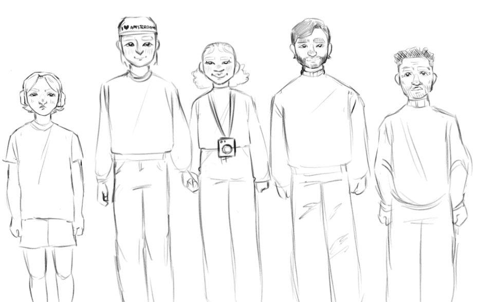
We start with an ad campaign across Amsterdam letting residents know some of the things they can do at OBA. The posters use a variety of actors (to show inclusion and diversity), a quote (to show what a visitor can do in the library), and the tagline “OBA - my library” to make visitors feel that the library is for them to use.
We integrated elements of nature throughout the space in the form of vegetation incorporated in the architecture, sounds of nature at certain locations, and using lighting that mimics sunlight in the space. The idea is to bring the outside in to the library.
Two short story dispensers were adapted to print out stories collated from the Huis van alle Talen collection. These work in conjunction with the institute that lends books to OBA. The print out also includes information on where the story came from (the book and collection the book can be found in) in case the user wants to read the source of the short story.
Finally we developed a way finding system to guide visitors through the library. The system uses BLE and NFC technology, and was developed with accessibility (colour-blindness in particular) in mind. Connecting with the NFC reader on a user’s phone, the user follows the light path to the bookshelf where the book is found.
The video below shows these solutions working together in a short user story:
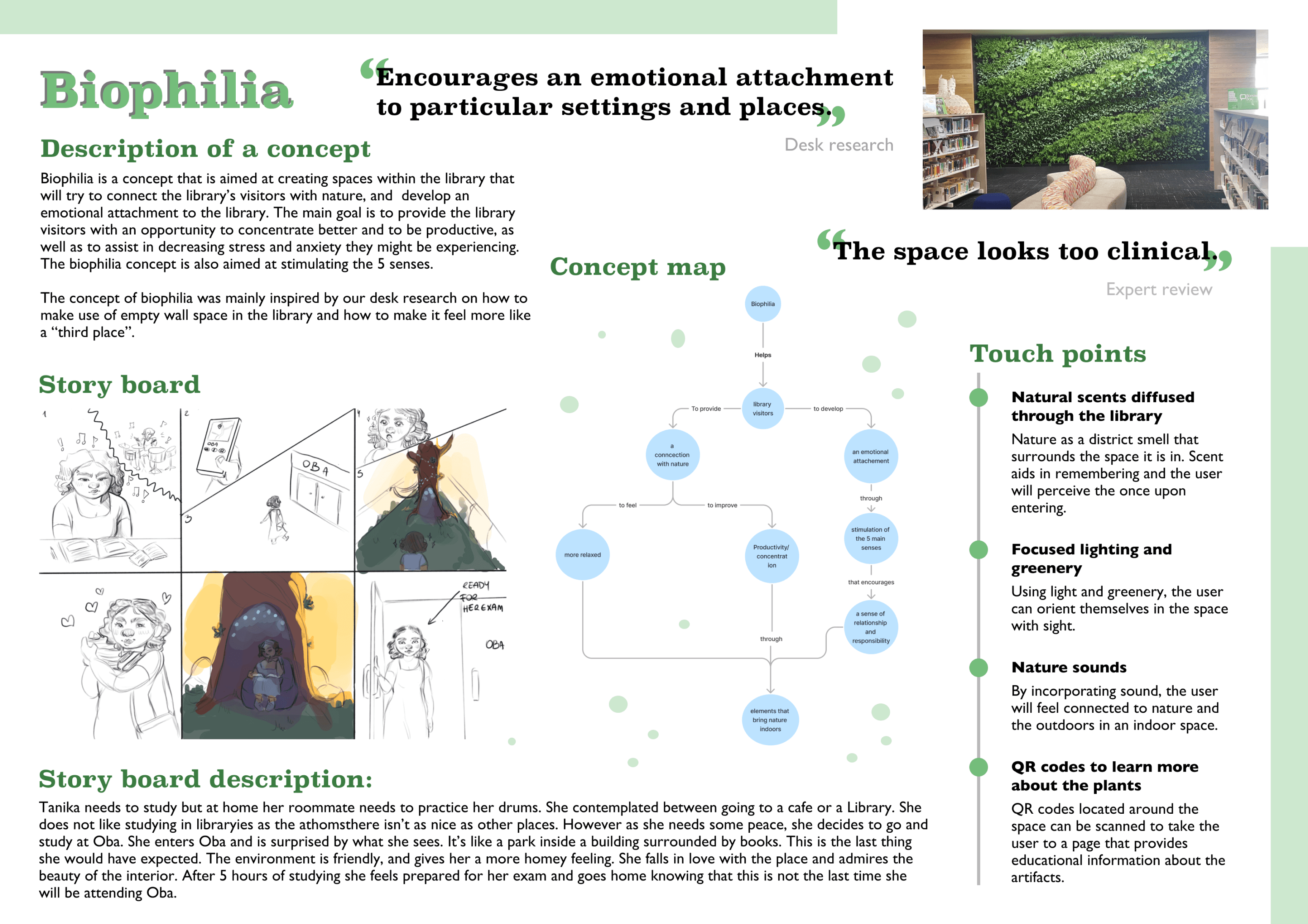
Biophilic Integration
We proposed elements of nature to be incorporated into the space (as opposed to just placing plants through the space). This creates a more concise and purposeful design, and allows the visitors to feel like it wasn’t an after thought. The nature elements also have QR codes placed next to them, adding an element of education and knowledge to reflect the notion of a library as a place of knowledge. These elements are placed throughout the library at different spaces to also encourage exploration and discovery by the visitors.
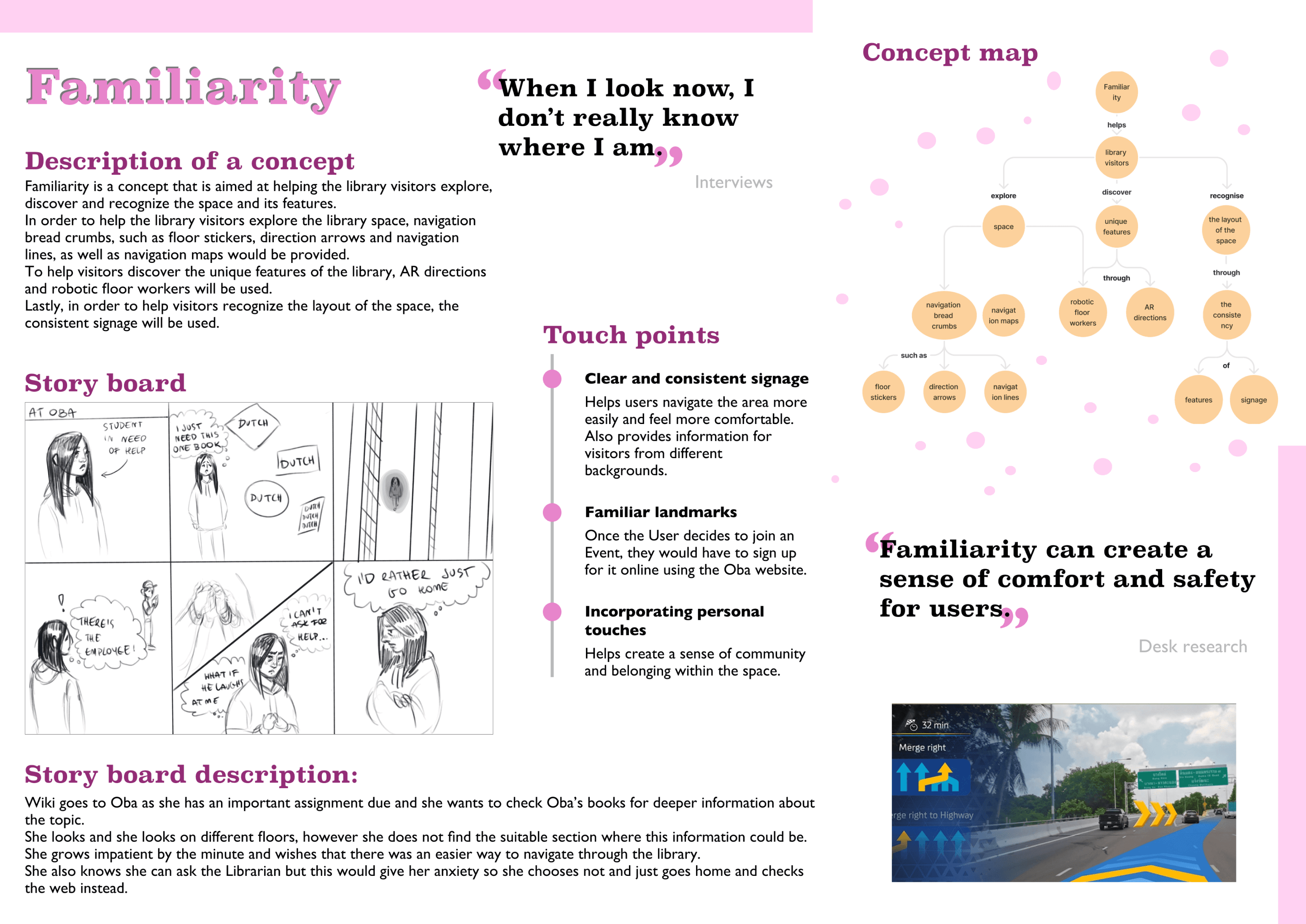
Familiarity
To help with discoverability and navigation, we proposed creating little accents throughout OBA that added more familiarity to the space. This is achieved by creating spots throughout the library that the visitor can use to get a sense of where they are and where they go beyond normal signage that has proven to be insufficient.
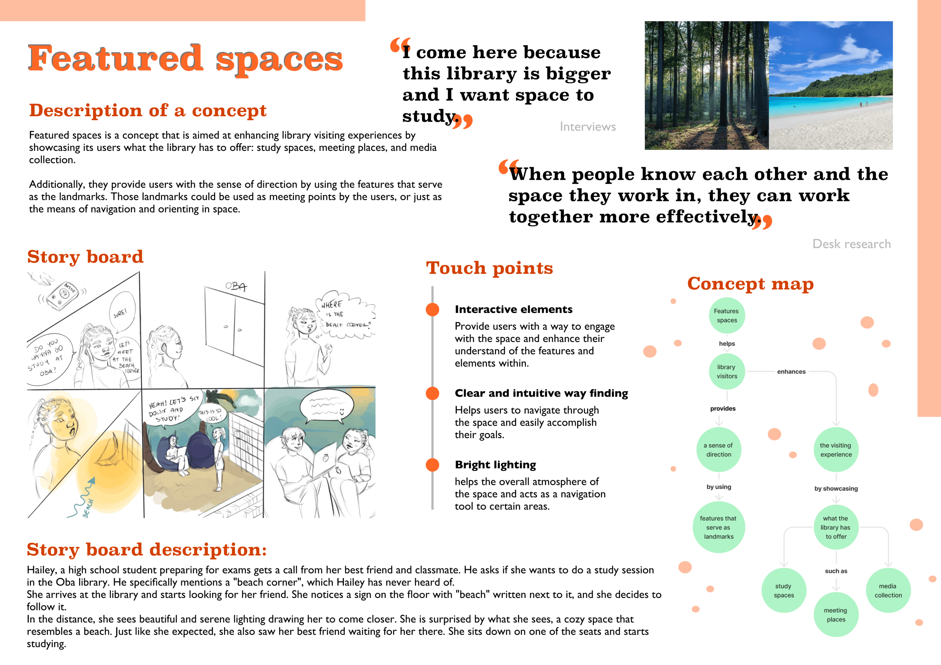
Featured Spaces
OBA wants the libraries to become a third place for the residents of Amsterdam. Currently our target group see the library only as a study space when they want to get away from distractions, and do not utilize other functionalities. In order to create a connection between the library and the visitors we developed the concept of featured spaces. These act as gathering spots as well as provide an escape from the immediate space while staying in the library.
Design Concepts
Solution
Change the perception of the library by rebranding elements of the interior to encourage visitors & members to frequent the space more often and to stay there longer.
As OBA has multiple branches, any solution we came up had some requirements to follow in order to be implemented.
Design Requirements
Modular: due to there being 27 branches across Amsterdam, all with different interior spaces, the design has to be modular and applicable to all of them.
Localized: any interaction that needs to happen should stay in it’s location so as not to distract.
Attracting without being distracting: any design should grab just enough attention when the user is not focused on a task, and should not distract them when they are in the middle of a task.
OBA tries to be inclusive: Oba has collections in various languages and tries to promote inclusivity. However, signage for some material is only available in Dutch, and for non-Dutch speakers, that presents a challenge in finding material.
Visitors from ages 10-18 go in groups: Youth visit OBA in groups of 2 or more. They aren’t interested in visiting OBA alone, and only choose friends that have similar productivity goals as they do.
Huis van alle Talen & Manga collection are not known: While visitors are aware that OBA has different collections, they are not aware of Huis van alle Talen & the Manga collection. This lack of awareness is one of the reasons the collections are not being utilized. The problem is lack of knowledge, not findability.
The interior of OBA is too monotonous: the library interior is dark and dull outside of the youth section. This tends to demotivate visitors and does not entice them to stay for long. The lighting system is distracting as it creates spots of low contrast across the library. The white walls are dull, and while they are not distracting, they are not encouraging either.
The youth section is very lively and inviting: the area dedicated to children up to ages 12 is very bright and colorful and inspires interaction by appearing to be fun and lively. This makes the age demographic very happy. This translates to them spending more time exploring that space and wanting to be present in it.
OBA visitors are not aware of what they can do other than study and borrow media: visitors to OBA assume that the only things they can do in the space is study and work, or check out some form of media. They are not aware of other facilities, such as the maker’s space, or the theatre, or nor are they aware of the various events that OBA has. This translates to less engagement in what OBA offers.
Insights
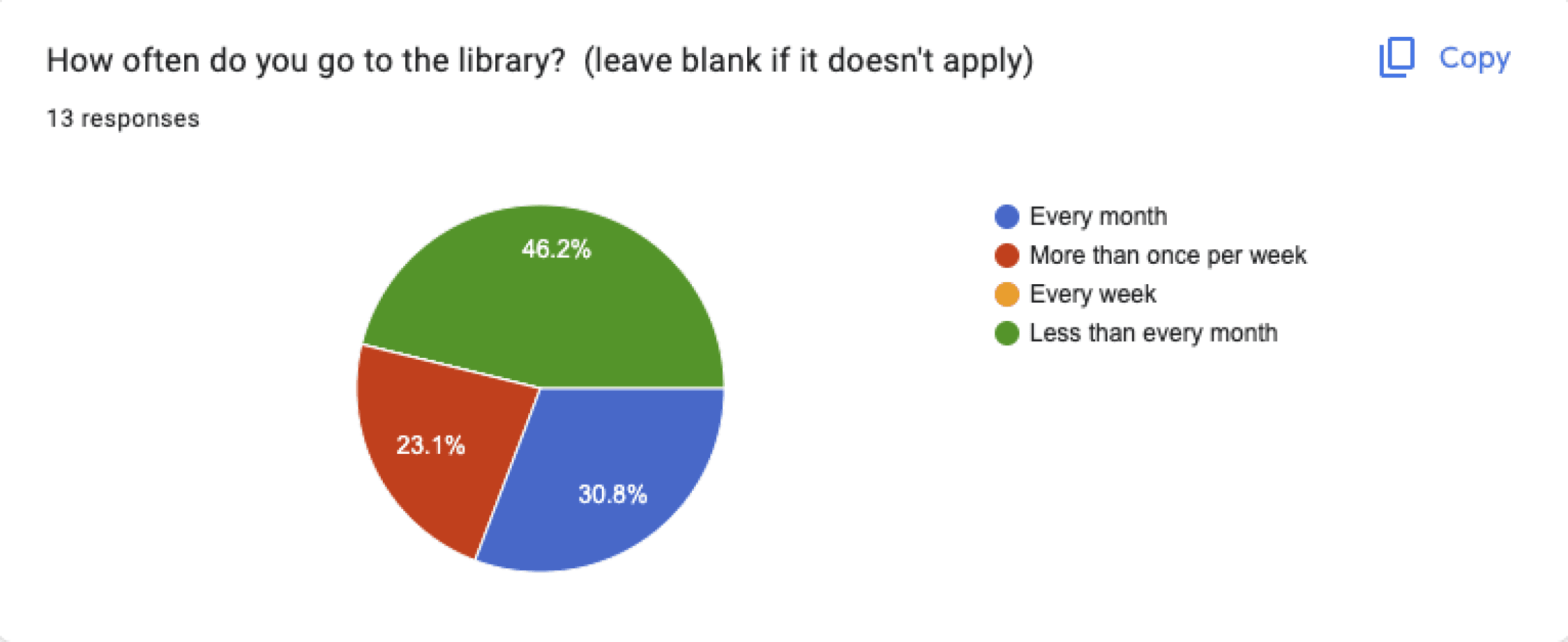
Survey Results:
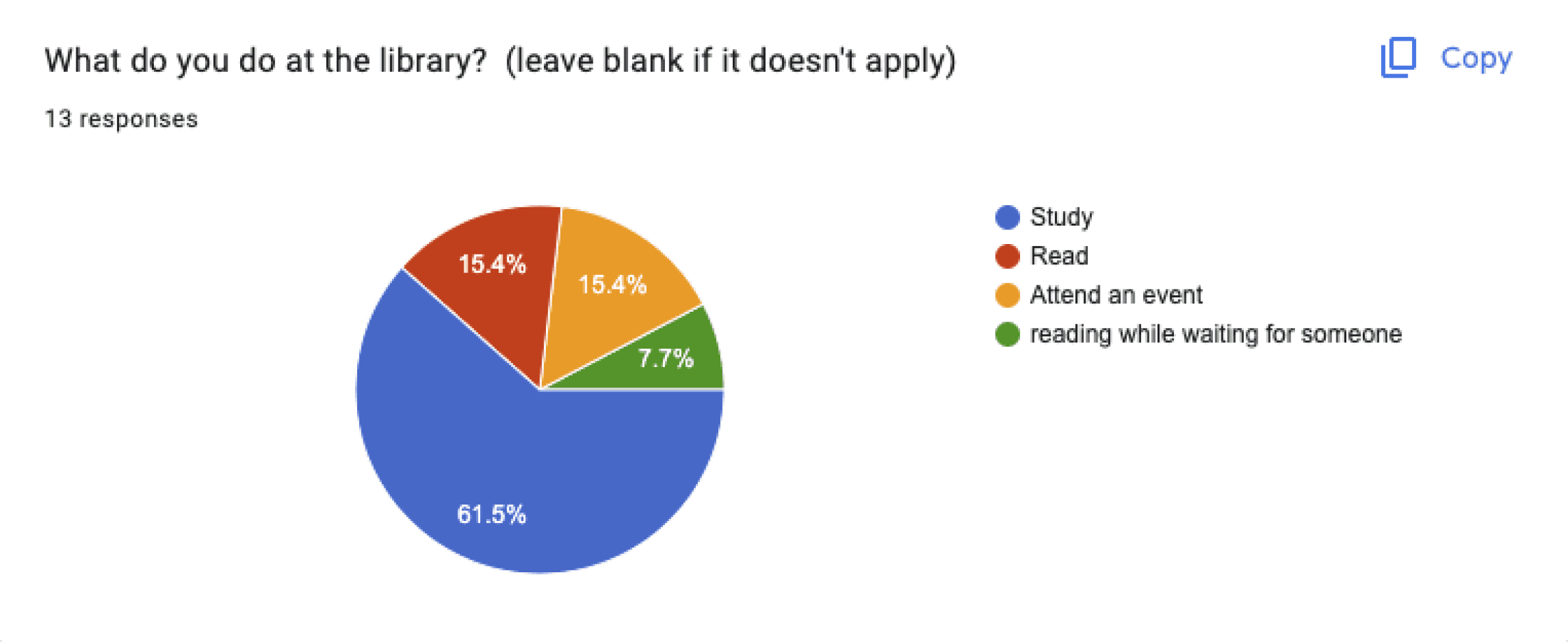
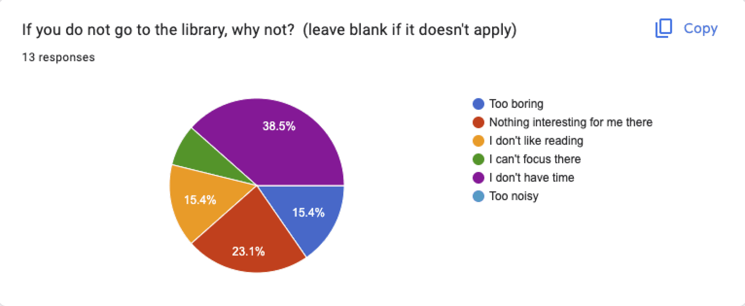
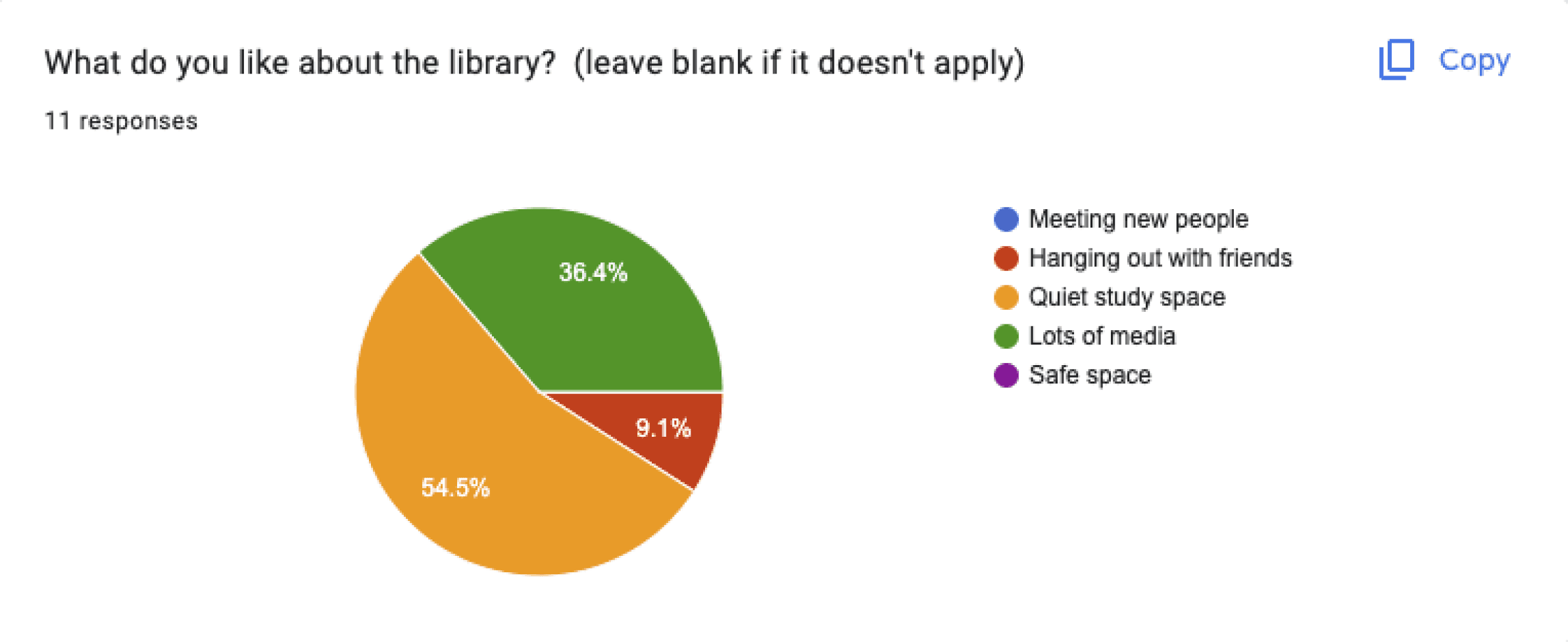
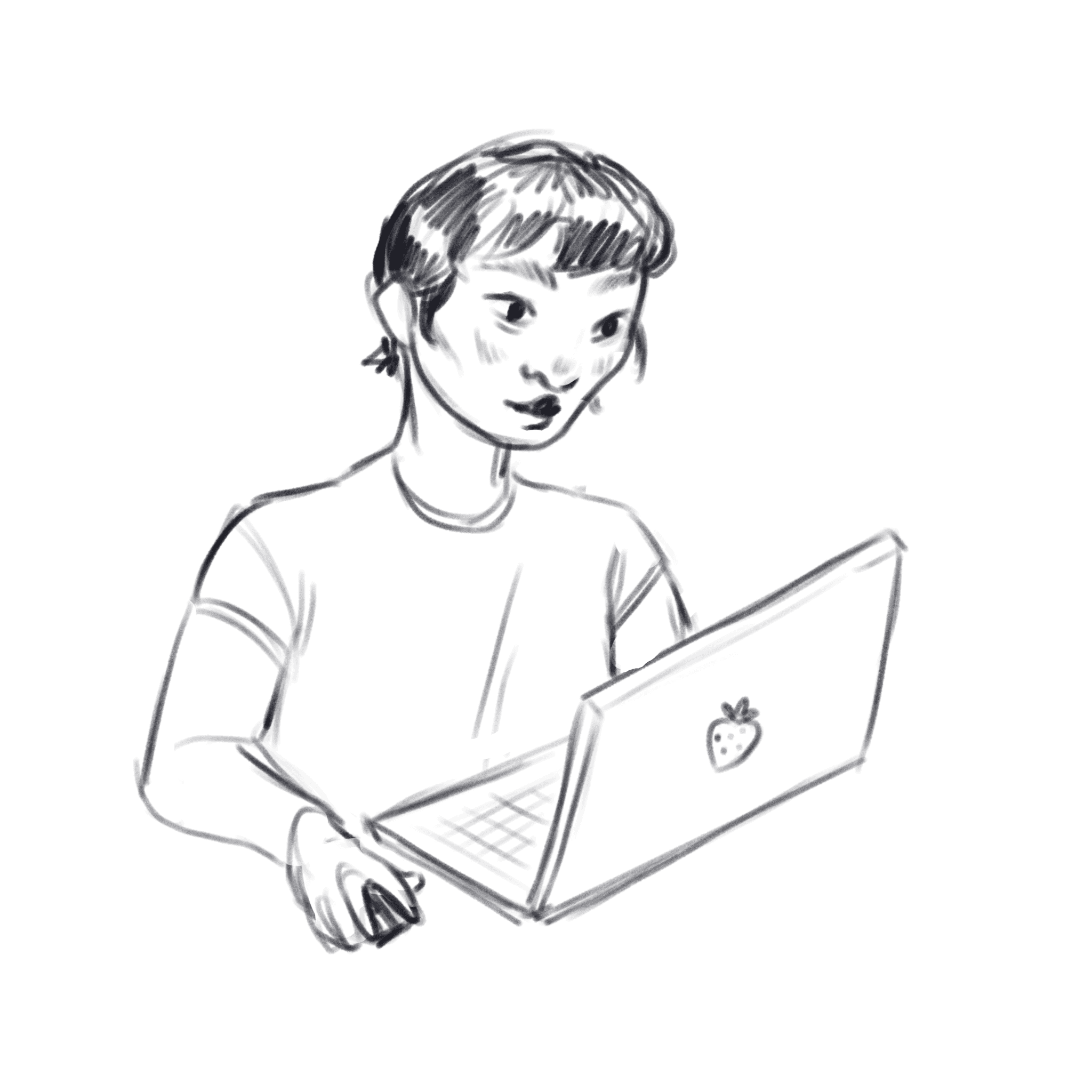
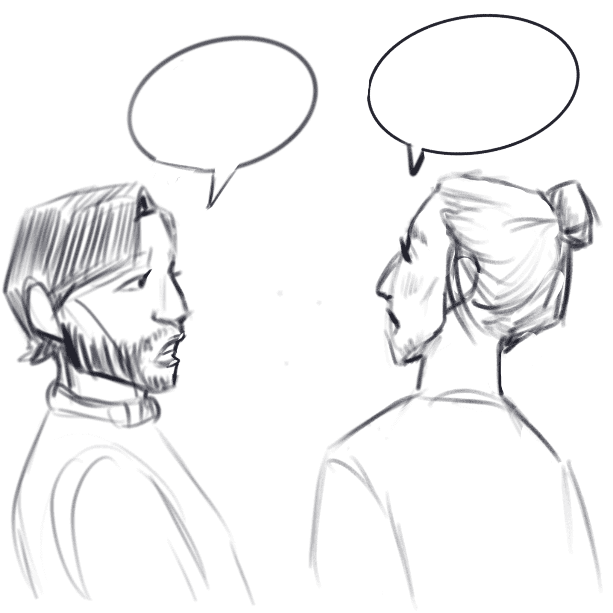
Research Questions:
How often do visitors visit the library?
How long does a visit to the library last?
What do visitors do in the library?
Are OBA visitors aware of the Manga/Huis van alle Talen collection?
What types of people visit OBA?
What help to OBA visitors need?
Do visitors ask about the Manga/Huis van alle Taalen collections?
What does an expert in architecture think of the OBA space?
Research
Goal:
Understand why visitors go to OBA, how they feel about the libraries, and if they know about what is happening in regards to the materials collection.
Methods:
User Interviews

Expert Review
Desk Research
Openbare Bibliotheek Amsterdam is the public library organization responsible for all public libraries in the Amsterdam region. With over 29 branches, the OBA aims to be a welcoming and safe third place for all visitors of all ages. Recently they introduced two new collections, the Huis van alle Talen (a collection of foreign language books), and a Manga collection. that they wanted to popularize with visitors from ages 10-18 years old. They also wanted to make book finding easier for visitors as they believe that to be an issue present with the amount of content that is hosted in their main branch in Oosterdok, Amsterdam.
This project was conducted as part of a university course and we were asked to work without budget constraints. The goal they wanted to achieve was to keep the library as a library while still offering services to visitors. OBA wanted to maintain their third place status for the citizens of Amsterdam, while exciting new visitors to engage with OBA in different contexts.
Role:
UX Researcher, Team Lead (5 person team)
Duration:
February 2023 - May 2023
Responsibilities:
UX Research, UX Design, Wireframing
Redesigning the interior of OBA to excite young visitors.