Conclusion
Onboarding processes aren’t very liked by users, but sometimes you have to balance usability with business decisions, and your goal as a UX designer is to find the best way to present that to the user.
Giving the user control of an onboarding process and allowing them to decide how much hand-holding they want to utilize creates a more positive experience and the user perceives themselves to be more competent with using the tool.
Research
Goal:
Understanding the user flow of Happynizr and how it compares to the competition.
Cognitive Walkthrough
Task analysis

Competitive Analysis
Heuristic Evaluation
Methods:
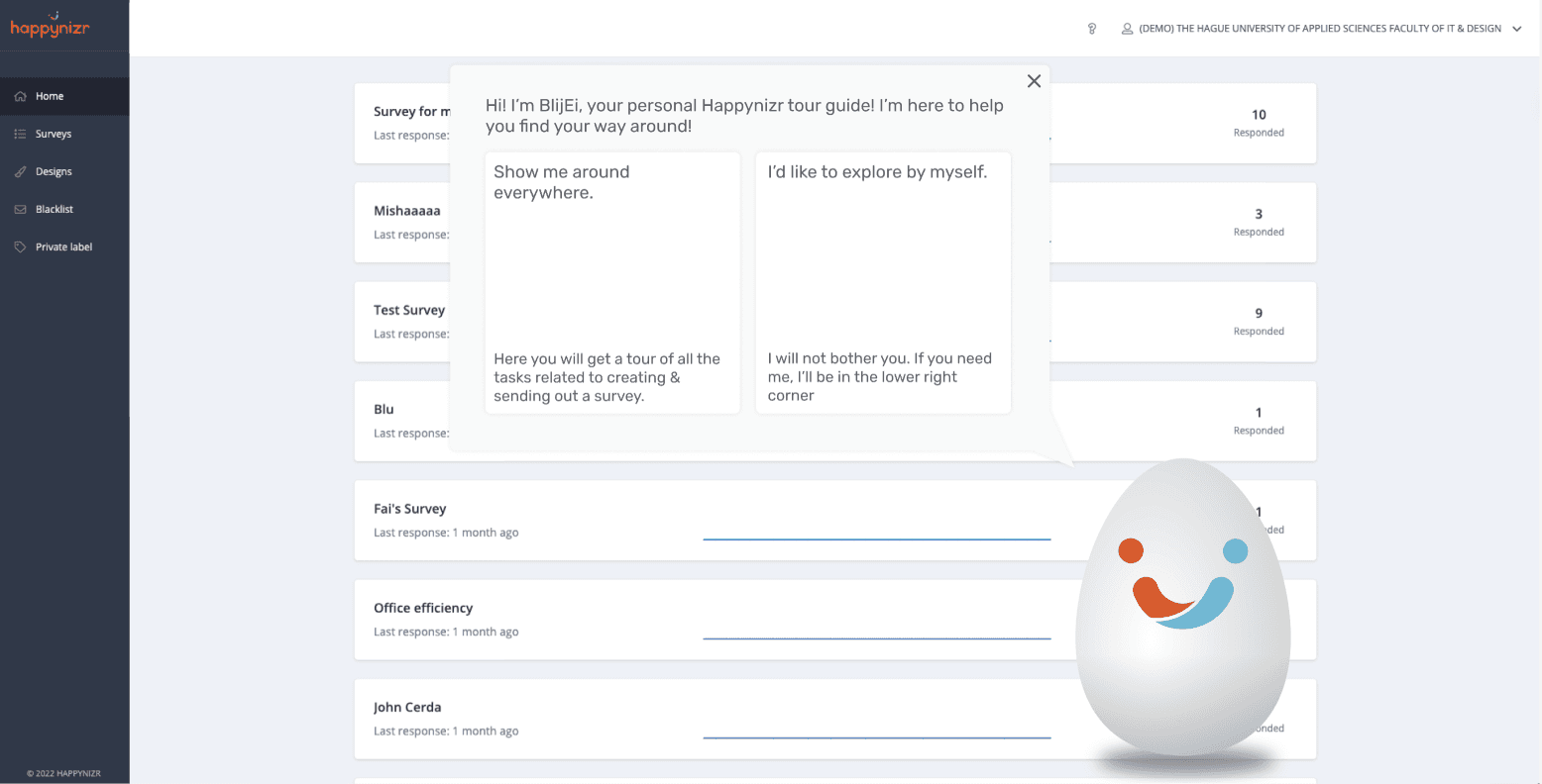
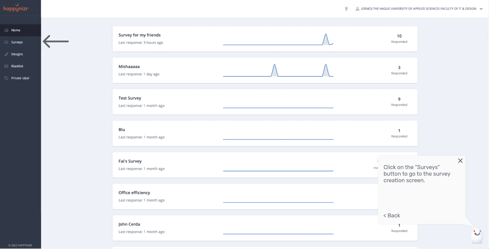
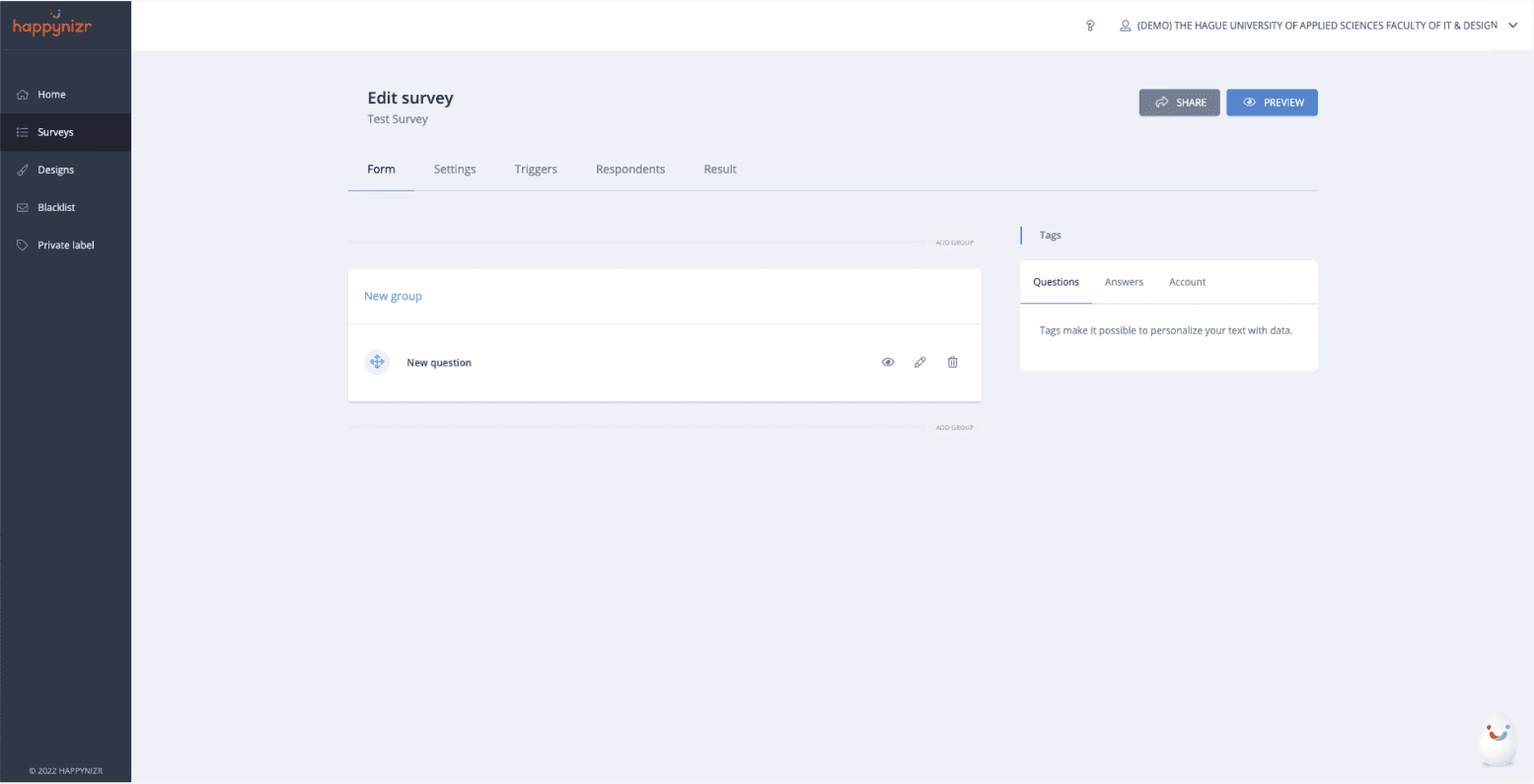
Wireframes
An onboarding process to help new customers or first-time users on the basic functionality of Happynizr. The process would be a quick solution for the company to implement without needing to rework the entire product.
I chose to focus on onboarding because during my meetings with Happynizr, they told me that a lot of the requests they get on the support line revolve around how to learn the product. They also wanted a solution that wouldn’t cost a lot of money to implement, and would be flexible for them to transfer if they need to change their core functionality in the future (something that was in discussion at the time of our meeting). A proper onboarding process will teach new users how to use the basic functions of the site, while still allowing them to contact customer support for any help. Sometimes even the best designed products still need the user to learn how to use them, and this is exactly what I opted for.
Solution

BlijEi: the mascot to guide a user through the onboarding process.
Should be focused on first-time users and new clients.
Can be upgraded- in case of a design change.
Frees up the team from support requests.
Does not hinder experts.
Cheap and quick to implement.
Requirements
Creating a survey is divided into unnecessary steps: creating and editing.
Creating and sending out surveys have a steep learning curve.
A lot of tasks on the Happynizer platform do not have clear calls to action.
As a SaaS, Happynizer does not have an on-site onboarding process for new users.
Not all Happynizer functions have helpful tooltips.
Insights
User Journey
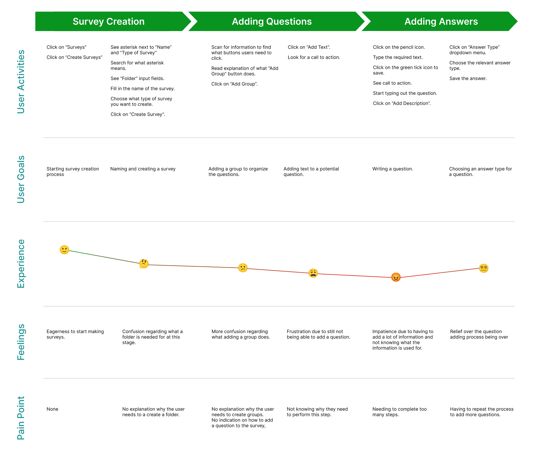

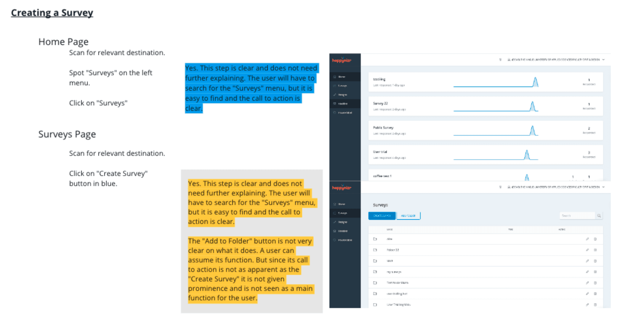
Task Analysis
Heuristic Evaluation
Cognitive Walkthrough
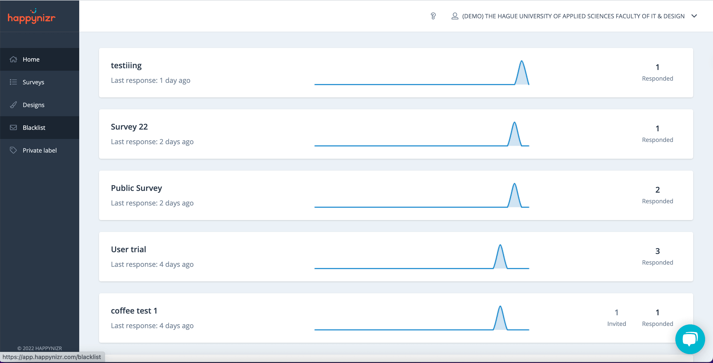
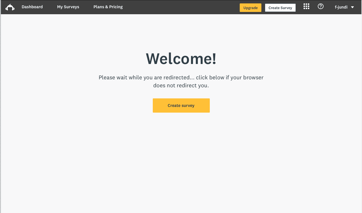
Competitive Analysis

Role:
UX Researcher, UX Designer (1 person team)
Duration:
April 2022 - May 2022
Responsibilities:
UX Research, UX Design, Wireframing
Happynizr is a growing startup that wants to expand their business. New users struggle with learning how to use the product, but Happynizr provides great customer service and one on one coaching for users to help them learn how to use the basic functions. As they are growing, the wait time for customer service agents is also growing, which means users have to wait a long time to get help.
In order to combat this, Happynizr asked me to come up with a solution that does not involved redesigning their base software as that means too much down time at a point of growth. From the research I conducted, I decided to create an onboarding process that takes new users through the basic functionality, leaving advanced features for customer service to help with.
Creating an onboarding process for Happynizr